How to create an accessible Tabs component in React?
August 22, 2021• ☕️☕️ 10 min read
Tabs component needs no introduction—they are ubiquitous. They are handy when we want to show a variation of UI content in a limited space, grabbing user attention to one item at a time. You might be using a few in your own web apps, allowing the user to switch between different tab items via mouse.
Oh did I say mouse? Yes, I did, and it was intentional. Keep the mouse away and try to navigate through each tab with a keyboard. Was it intuitive? Could you use arrow keys to navigate through each tab item?
If the answer is yes, you should be proud and feel happy that one day when your mouse is not working, or a person who is totally relying on a keyboard due to impaired motor skills, can still use your Tabs component. You can sleep well at night knowing that you have done a great job.
But sadly, unless you’re using a third-party library, chances are high that your React-based implementation only works with a mouse, throwing keyboard accessibility out of the window. And that’s unacceptable.
Through this article, my aim is to lift the tension or burden that implementing a keyboard-accessible interface is hard. We’ll start by implementing a basic inaccessible Tabs component in React that will only work with a mouse. And then slowly enhance it to make it keyboard-accessible as per WCAG guidelines. I must mention that this implementation is inspired by Chakra-UI and the Reach UI tabs component. My big thanks to the contributors.
Let’s get started.
I have a fancy mouse
There are two approaches that I have seen to work well with the Tabs interface: composition-based, and configuration-based. Open source libraries like Reach UI and Chakra-UI, rely on the former approach, giving you little building blocks to construct a full-fledged UI. This allows more flexibility and customization. But the mechanism for keeping track of tab DOM nodes is a little challenging.
// Composition based approach
import { Tabs, TabList, Tab, TabPanels, TabPanel } from '..';
<Tabs>
  <TabList>
   <Tab>One</Tab>
   <Tab>Two</Tab>
  </TabList>

  <TabPanels>
    <TabPanel><p>Tab content 1</p></TabPanel>
    <TabPanel><p>Tab content 1</p></TabPanel>
  </TabPanels>
</Tabs>
With the config approach, we pass in an array data structure to render our tab items. Thus, we can use the array index to easily keep track of active and sibling tab items.
// An example of config based approach
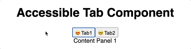
const tabsConfig = [
{
label: "Tab1",
content: "Content Panel 1",
icon: "😍"
},
{
label: "Tab2",
content: "Content Panel 2",
icon: "🤓"
},
];
// And then in our Tabs component, we'll use it like:
<Tabs tabsConfig={tabsConfig} />
In our code example, we’ll use the config approach as shown in the previous snippet, constructing the tab and its content based on each array item in the config array.
The following is the starting point of our Tabs widget, starting with a bare minimum of HTML and a little JavaScript.
const Tabs = ({ tabsConfig, defaultIndex }) => {
  // default index value will be used to set the intial active tab

  return (
    <>
      <div>
        {tabsConfig.map((tab, index) => (
          <button key={`tab-${index}`}>
            {tab.icon}
            {tab.label}
          </button>
        ))}
      </div>
      <div className="tabpanel-wrapper">
        {tabsConfig.map((tab, index) => (
          <section key={`tabpanel-${index}`}>
            {tab.content}
          </section>
        ))}
      </div>
    </>
  );
};
Now, it’s time to bring our click handler and state variables in:
import { useState} from 'react';

const Tabs = ({ tabsConfig, defaultIndex }) => {

 const [selectedIndex, setSelectedIndex] = useState(defaultIndex ?? 0);

 const handleClick = (index) => setSelectedIndex(index);
  return (
    <>
      <div>
        {tabsConfig.map((tab, index) => (
          <button
             key={`tab-${index}`}
             onClick={() => handleClick(index)}
           >
            {tab.icon}
            {tab.label}
          </button>
        ))}
      </div>
      <div className="tabpanel-wrapper">
        {tabsConfig.map((tab, index) => (
          <section
             key={`tabpanel-${index}`}
             hidden={selectedIndex !== index}
          >
            {tab.content}
          </section>
        ))}
      </div>
    </>
  );
};
Note that we’ve used hidden attribute to hide the inactive tabpanel. Here’s the codesandbox demo for our example above.
At this point, our tab is functional and we can use the mouse to switch between tab contents. You can style it to enhance its aesthetics.

But hang on, can you use the keyboard right/left arrow to move between tabs? I bet you can’t. And I’ve seen many naive implementations like this, completely ignoring the keyboard accessibility, making it only mouse-friendly. React gives you so much power that we end up exploiting it by creating so many inaccessible widgets. I wouldn’t be wrong by saying that React is a curse when it comes to creating widgets like this—throw a couple of state variable and click listener, and be done with it.
Here’s the codesandbox demo for the preceding implementation.
Who moved my aria attributes
Before we go ahead, we need to set our foundation right—the necessary aria attributes. In a tab component, each element carries a role. Let’s quickly revisit a slimmed version of the role table straight from the W3C guidelines.
| Role | Usage |
|---|---|
| tablist | Indicates that the element serves as a container for a set of tabs. |
| tab | Indicates the element serves as a tab control. |
| tabpanel | Indicates the element serves as a container for tab panel content. |
I highly recommend reading the full table to comprehend the other roles’ implications. Aria attributes have no visual effect, but they are crucial for constructing an accessibility tree, which in turn, helps the screen reader to announce valuable aspects of the widget.
Let’s quickly add them in to their right places:
const Tabs = ({ tabsConfig, defaultIndex }) => {

 const [selectedIndex, setSelectedIndex] = useState(defaultIndex ?? 0);

 const handleClick = (index) => setSelectedIndex(index);

  return (
    <div>
      <div role="tablist" aria-orientation="horizontal">
        {tabsConfig.map((tab, index) => (
          <button
            key={`tab-${index}`}
            click={() => handleClick(index)}
            role="tab"
            aria-controls={`panel-id-${index}`}
            aria-selected={selectedIndex === index}
            id={`tab-id-${index}`}
          >
            {tab.icon}
            {tab.label}
          </button>
        ))}
      </div>
      <div className="tabpanel-wrapper">
        {tabsConfig.map((tab, index) => (
          <section
            key={`tabpanel-${index}`}
            hidden={selectedIndex !== index}
            role="tabpanel"
            aria-labelledby={`tab-id${index}`}
            id={`panel-id-${index}`}
          >
            {tab.content}
          </section>
        ))}
      </div>
    </div>
  );
};
Referring back to the WAI-Aria table, we’ve also used recommended aria attributes. Let’s talk about them quickly, as they are important for making our Tab component accessible.
| Aria attribute | Element (role) | Usage |
|---|---|---|
| aria-orientation | div (tablist) | Indicates that the element serves as a container for a set of tabs. |
| aria-selected | button (tab) |
|
| aria-controls | button (tab) | Refers to the tabpanel element associated with the tab. |
| aria-labelledby | section (tabpanel) |
|
Note: We have used
ids, based on array indices, to create the recommended association (via aria-controls, and aria-labelledby) between tabs and tabpanels. If you are creating a reusable component, you might need to create unique dynamic ids.
Here’s the codesandbox demo for the example code above. Additionally, check how our voiceover announces the useful information when we’re switching between the tabs in the video below. This information was missing in our first mouse-based implementation.
Isn’t that a beautiful thing? Wait till we implement keyboard accessibility; you can close your eyes and switch between tabs knowing which tab you’re on.
Adding keyboard accessibility
With the mouse and aria attributes aside, it’s time to enhance our Tabs interface with keyboard accessibility. For this, we need to handle the following:
- Allow users to use
rightandleftarrow keys to switch between the tabs. - Pressing the
Homekey should activate the first tab. - Pressing the
Endkey should activate the last tab.
For a full description of the keyboard support, I recommend checking the table as described in the W3C Tabs widget example. We’ll also look into focus management in a separate section, later in this article.
Note that we’ll be implementing an automatic activation approach in our solution, which means that the tab with a focus is also activated, and its associated tabpanel content is visible. Conversely, the manual activation approach only allows moving the focus with arrow keys. And then pressing the
EnterorSpacekey will activate (open) the tabpanel content thereafter.
Before we add our key handler, we need to store the actual DOM node references for our tab elements (button). This will allow us to identify the selected tab element, and programmatically invoke the focus on it via element.focus(). We can use the useRef hook for this purpose.
The following code snippet collects node references for each tab element in an object with array index as its key.
const Tabs = ({ tabsConfig, defaultIndex }) => {
  // ...rest of the code ...

  // to store reference to the tab element
  const tabRefs = React.useRef({});

  return (
    <div>
      <div role="tablist" aria-orientation="horizontal">
        {tabsConfig.map((tab, index) => (
          <button
            key={`tab-${index}`}
            ref={(element) => (tabRefs.current[index] = element)}
            {/* ..rest of the props */}
          >
            {tab.icon}
            {tab.label}
          </button>
        ))}
      </div>
      {/* hiding rest of the code for brevity. */}
    </div>
  );
};
With the housing of DOM elements done, it’s time to sprinkle in our long-awaited onKeyDown event handler. The following snippet shows one of the various implementations:
const Tabs = ({ tabsConfig, defaultIndex }) => {
  // ...rest of the code ...

  // Selected tab update helper
  const setIndex = (index) => {
    const tab = tabRefs.current[index];
    if (tab) {
      // focus() will call the state setter
      // to display the associated tabpanel
      tab.focus();
    }
  };

  // onKeyDown handler for tab elements
  const onKeyDown = (event) => {
    const count = tabsConfig.length;
    const nextTab = () => setIndex((selectedIndex + 1) % count);
    const prevTab = () => setIndex((selectedIndex - 1 + count) % count);
    const firstTab = () => setIndex(0);
    const lastTab = () => setIndex(count - 1);

    const keyMap = {
      ArrowRight: nextTab,
      ArrowLeft: prevTab,
      Home: firstTab,
      End: lastTab,
    };

    const action = keyMap[event.key];
    if (action) {
      event.preventDefault();
      action();
    }
  };

  return (
    <div>
      <div role="tablist" aria-orientation="horizontal">
        {tabsConfig.map((tab, index) => (
          <button
            onKeyDown={onKeyDown}
            onFocus={() => setSelectedIndex(index)}
            tabIndex={selectedIndex === index ? 0 : -1}
            {/* ...rest of the props */}
          >
            {tab.icon}
            {tab.label}
          </button>
        ))}
      </div>
        <div className="tabpanel-wrapper">
        {tabsConfig.map((tab, index) => (
          <section
            role="tabpanel"
            tabIndex={0}
            {/* rest of the props */}
          >
            {tab.content}
          </section>
        ))}
      </div>
    </div>
    );
};
Along with the onKeyDown, we have utilised onFocus event handler that gets triggered inside our little setIndex helper. This is known as invoking focus programmatically. And to make it possible, we have used tabIndex prop. Setting tabIndex to -1 for non-activated will remove them from sequential keyboard order (Tabbing). This is also a part of the W3C Tabs Keyboard support criteria, and it says:
| Key | Function |
|---|---|
| Tab |
|
To meet the second bullet point requirement of the preceding table (making tabpanel focusable), we have added tabindex=0 attribute to our tabpanel element (with role=“tabpanel”). This will put our tabpanel element into sequential keyboard tab order. Simple and easy!
The following gif shows the usage of our Tabs component via keyboard only.
Here’s your codesandbox demo to play with. Try using the right/left arrow keys to switch between tabs. Additionally, tabbing out from the active tab (role=“button”) will move the focus to the associated tab panel. Isn’t that awesome and satisfying? You can use this component with your eyes closed too.
The video above shows how the voiceover (mac) announces the selected tab when you switch between tabs. It means, not only keyboard users, but users with impaired vision can also benefit from our accessible implementation. This is a moment of joy and pride. You can pat yourself on the shoulder and sleep well at night. Well done!
And as a bonus for reading this far, I’ve created another demo that extends our previous implementation with the following goodies:
isManual: allows switching between automatic and manual activation.onChange: function that gets trigger by the selected tab index.Controlled component: passing inindexalong withonChangewill make yourTabsa controlled component.useId hook: this is copied straight from Reach-UI library. Something you can use internally for your own projects too 🚀.Styles: a bit of styling to make the tab widget look nice.
Conclusion
Developing with accessibility is a skill in itself. It may sound daunting in the beginning, but once you are into it with the right mindset, knowing that your implementation would help millions of users, the outcome is so fruitful and satisfying. I strongly believe that, as web developers, it’s our sole responsibility to put time and effort into making our UI accessible. And with the plethora of readily accessible learning resources, I don’t think there is any excuse for omitting it. We can start from today.
I’ve written another article to get you up and running with accessibility in mind. Now go and convince your project manager and start adding accessibility to your ticket’s acceptance criteria.
Happy coding.
References:


Written by Amandeep Singh. Developer @ Avarni Sydney. Tech enthusiast and a pragmatic programmer.